OVERVIEW
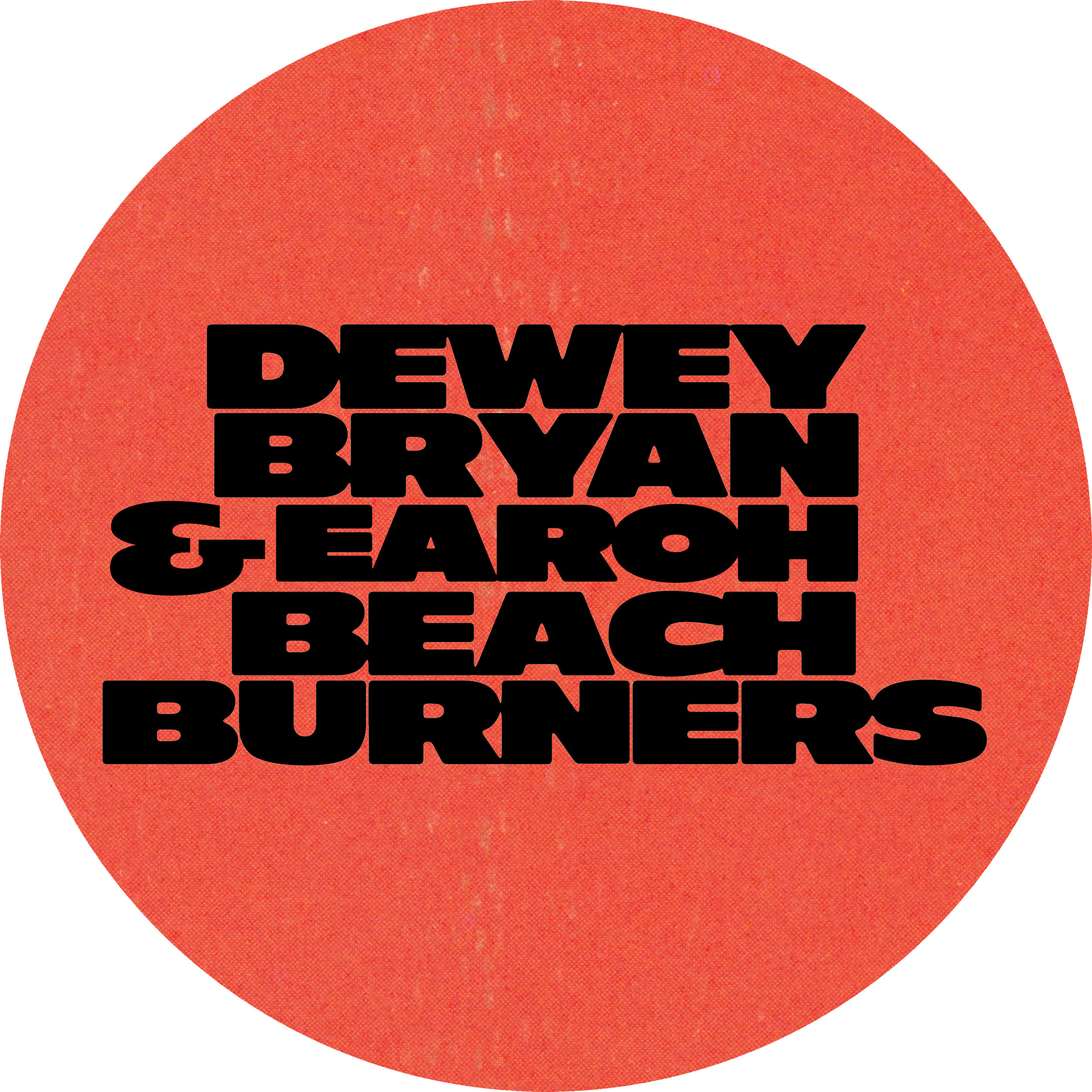
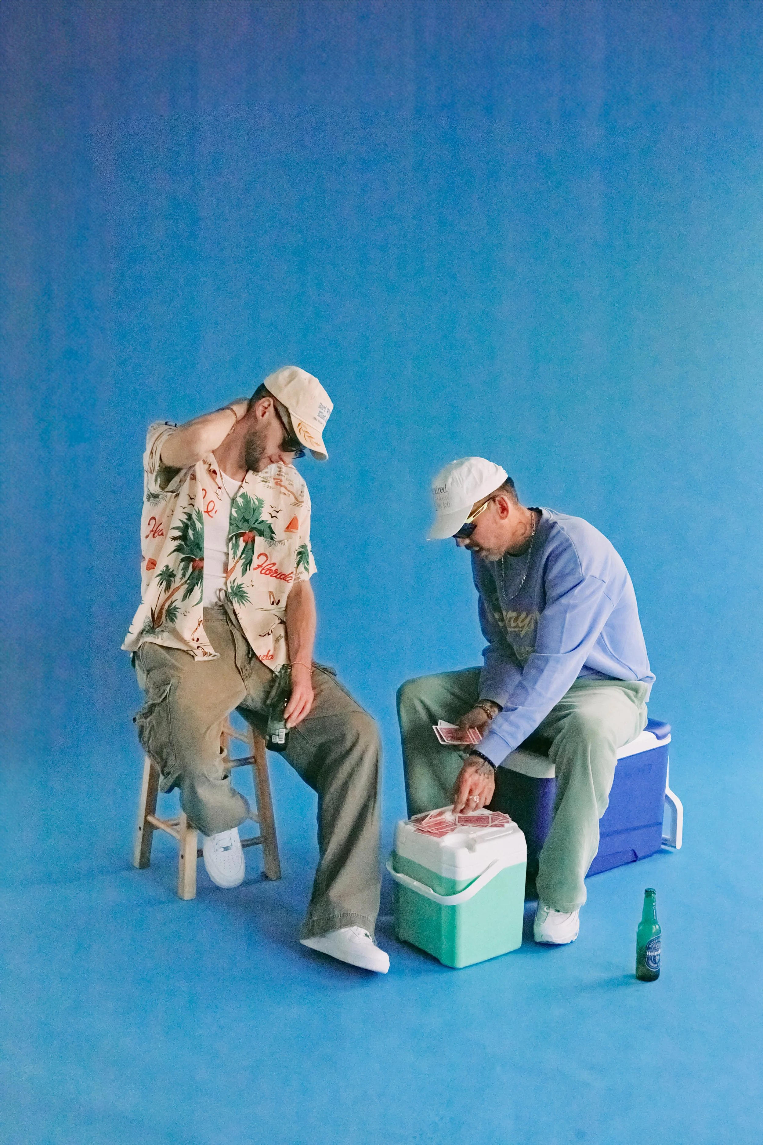
Beach Burners is the debut album by Dewey Bryan, created in collaboration with producer Earoh. Beyond the music itself, the project was developed as a fully immersive visual world. My role was to create a design system that could seamlessly integrate across album artwork, music videos, merchandise, events, and branded ephemera — establishing Beach Burners not only as a record, but as a cultural brand.

Case Study overview
INSPIRATION
MOOD BOARD
EXPERIMENTAION
EXECUTION
SOCIAL STRATEGY

CASE STUDY
CASE STUDY

■ INSPIRATION
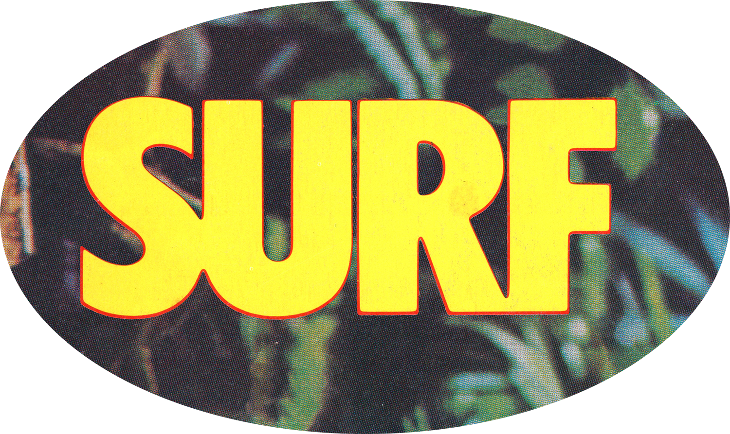
Vintage Surf Media: 1980s surf magazines provided a graphic vocabulary of bold type treatments, sticker-like logos, parody ads, and editorial layouts. Magazines like high times from the 70’s provided the hustlers ethos, a light hearted attitude of a low level dealer.
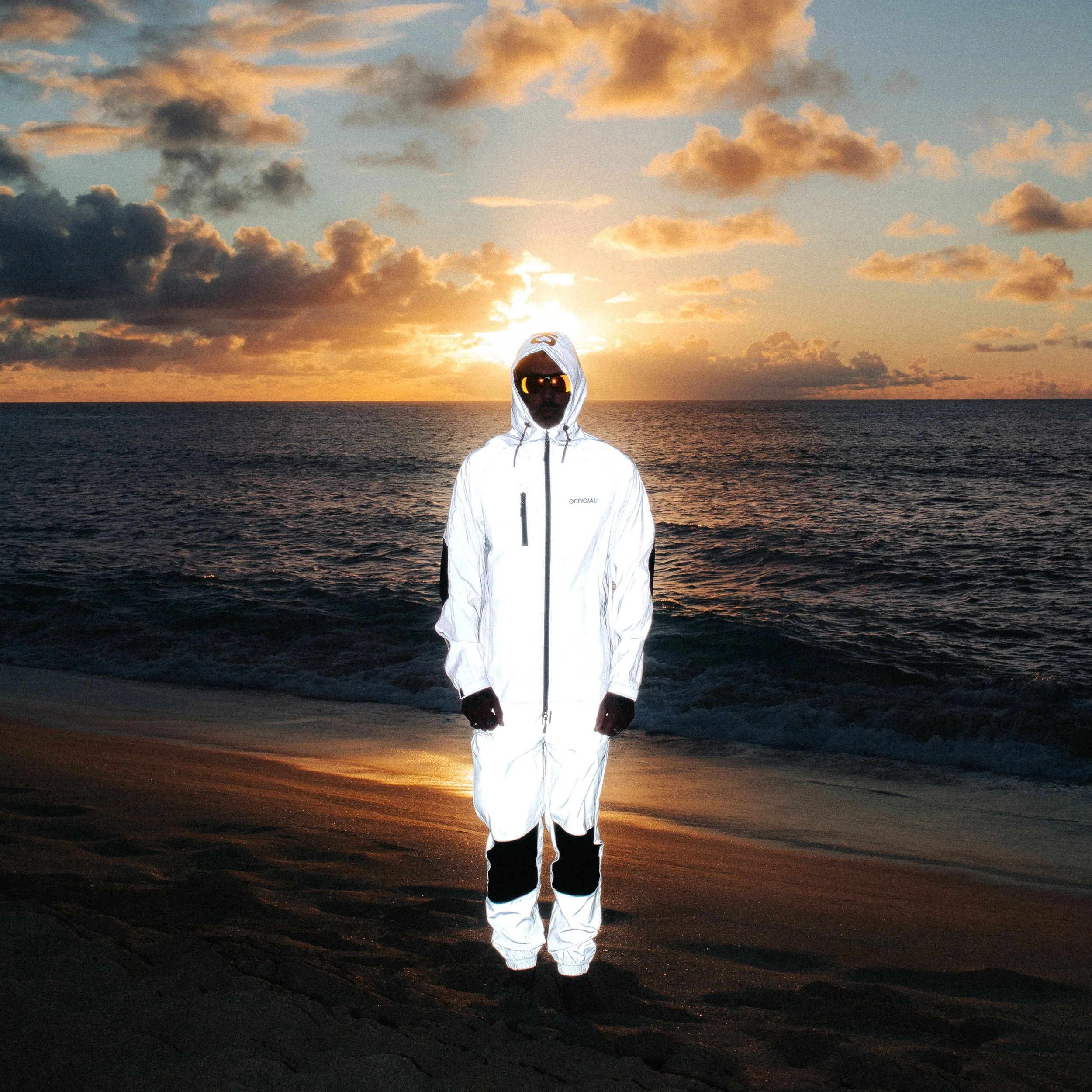
Outlaw Cinema: Films like Point Break, Heat, Speed, Captain Ron, and Club Paradise informed the narrative tone — a mix of tropical escapism, noir tension, and smuggler mystique.


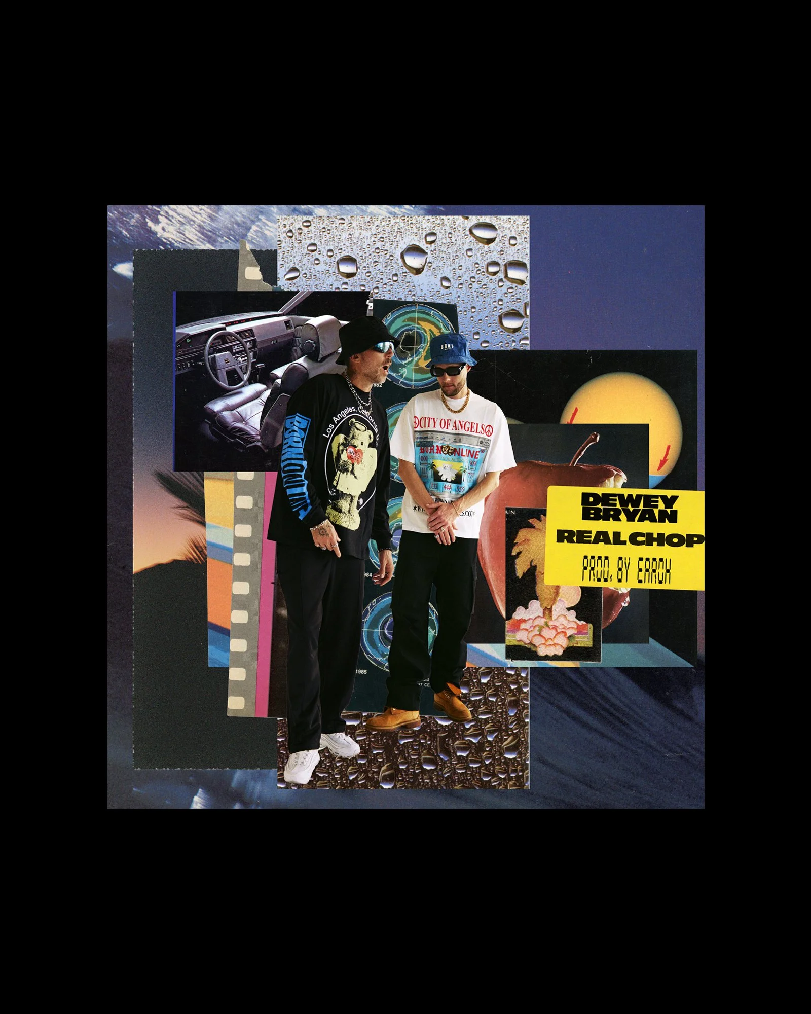
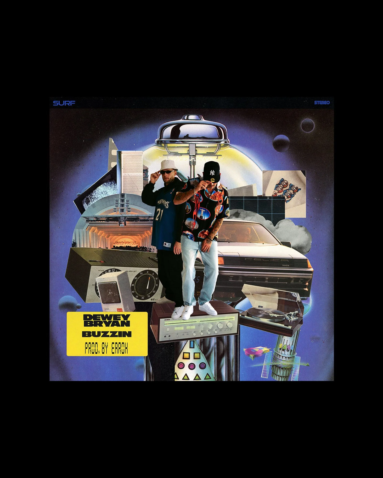
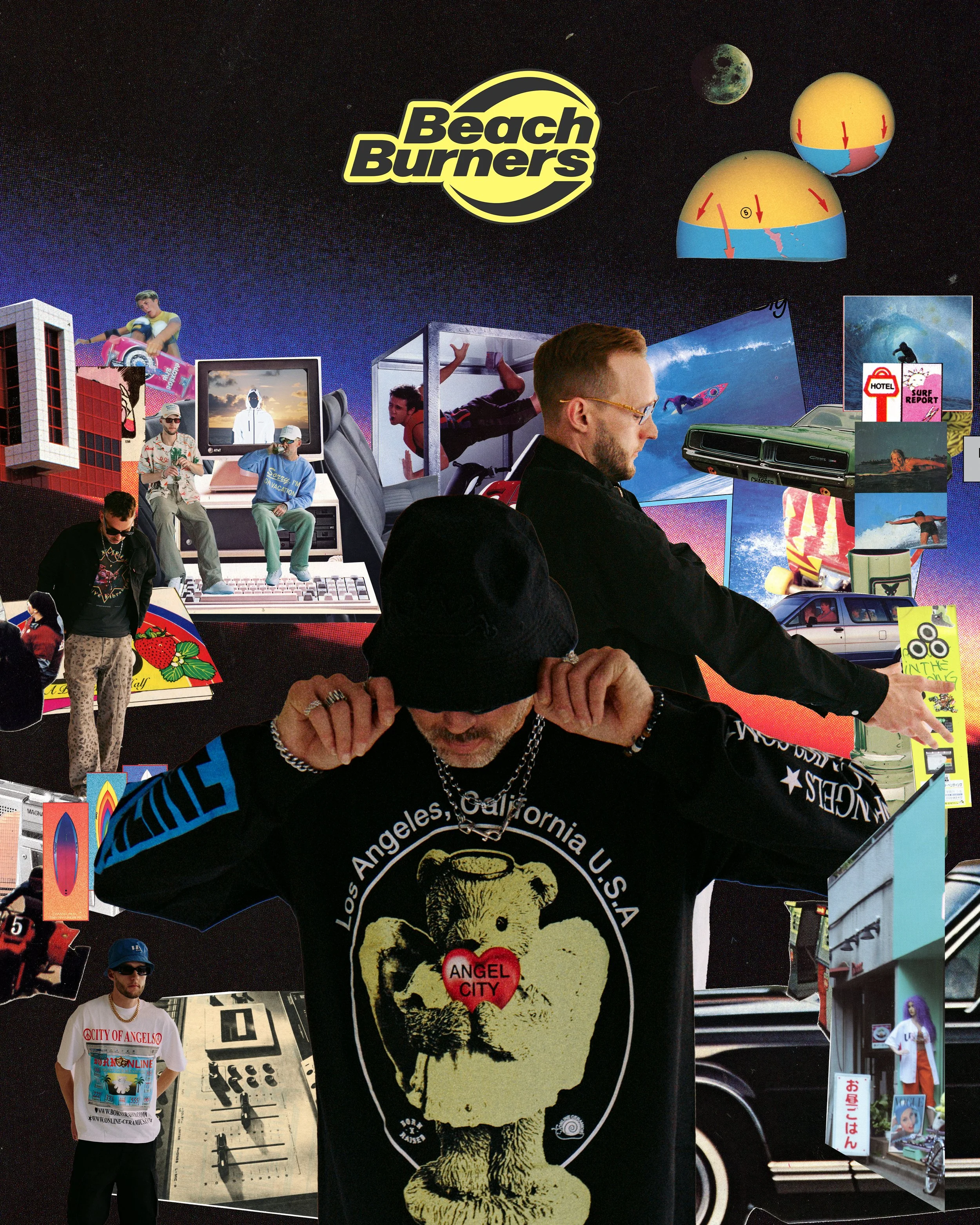
■ Artwork Strategy
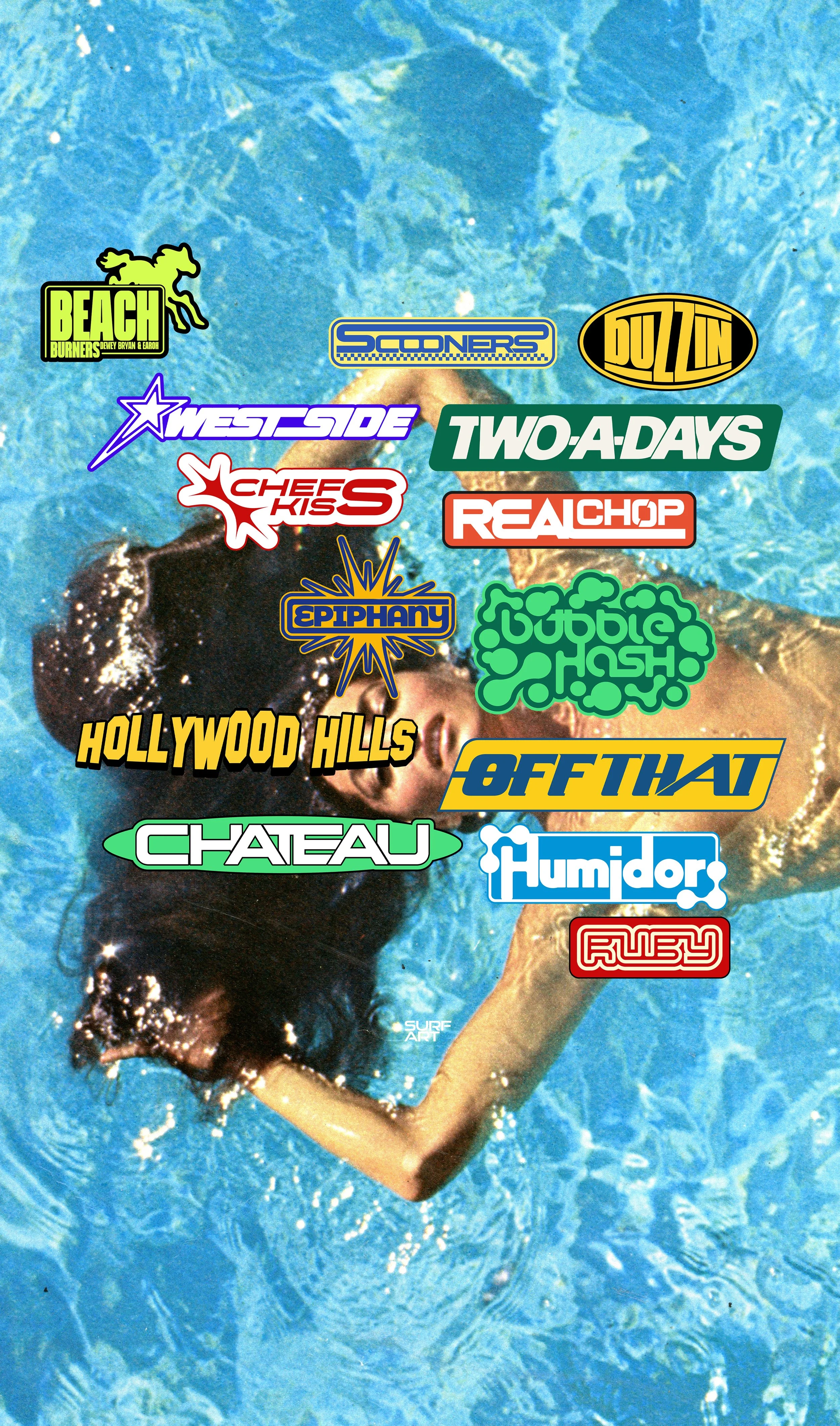
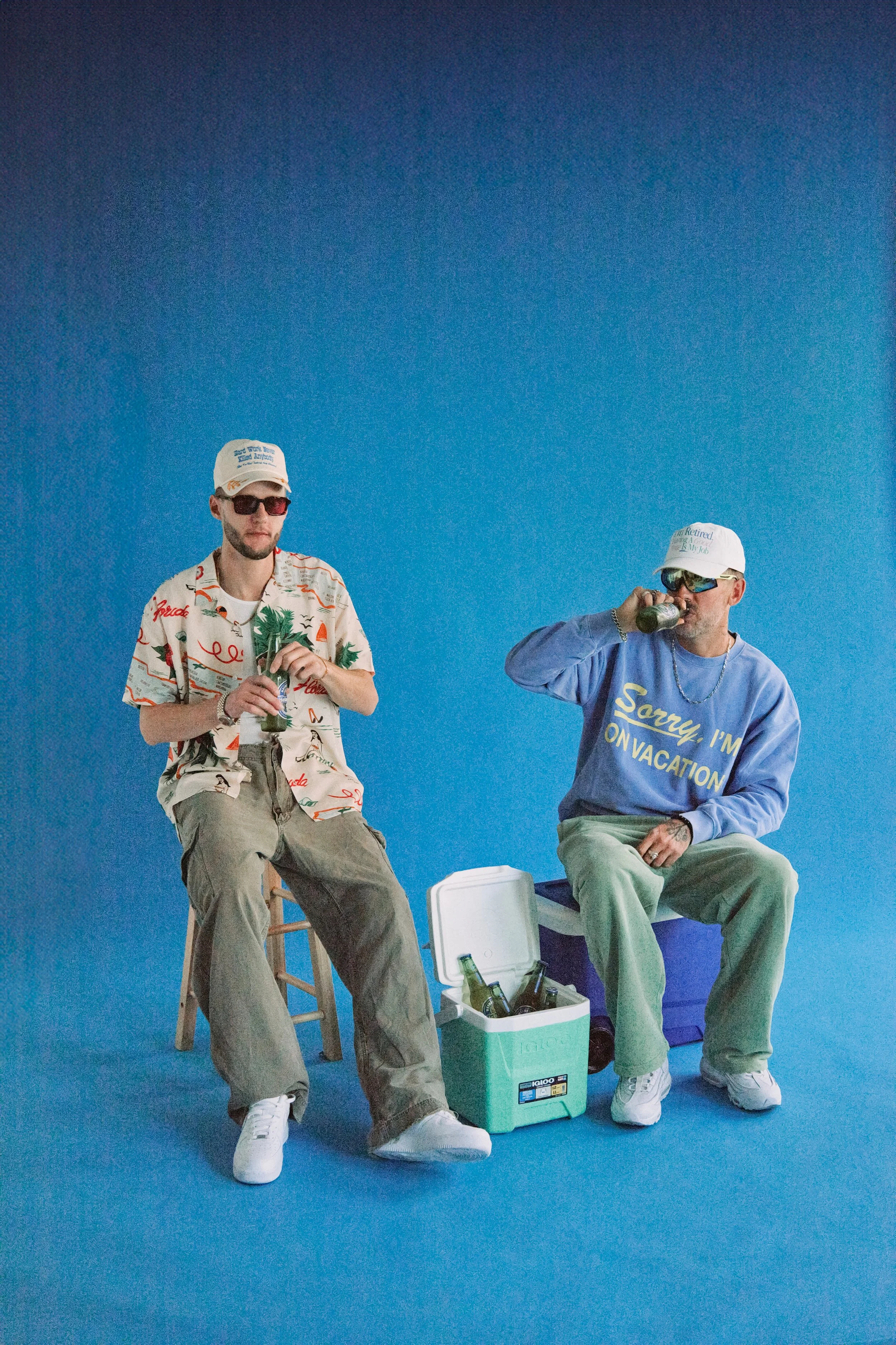
The visual identity for Beach Burners draws from vintage surf magazines and outlaw cinema, translating those references into a cohesive design system. Reflective suit portraits against sunset coastlines established the album’s mythic, futuristic protagonist, while a custom typographic system gave each track its own surf-inspired logo, functioning collectively as a sticker pack. Collaged ephemera — including parody Japanese radio ads, mock surf magazine covers, and sticker-bombed vehicles — expanded the world beyond the album, while merchandise, zines, and event collateral extended the brand into physical space. Together, these elements created a layered identity that blurred the line between record release and lifestyle brand.